Generative UI in Rails with RubyLLM
Chat is a natural interface for LLMs, and a lot of things work well inside it. But visual responses — cards, buttons, choices, inline widgets — have already become a baseline user expectation: tables and charts in ChatGPT answers, quick replies in support bots, forms and confirmations in banking assistants.
I want to give the model that same freedom of form in my Rails app — without letting it generate the HTML directly. Let the LLM choose what to show; the application still decides how to render it.
Plain chat: text
Let’s spin up a chat on RubyLLM and give it one ordinary tool right away — a weather data source:
rails new chat_app --css tailwind
cd chat_app
bundle add ruby_llm
bin/rails generate ruby_llm:install
bin/rails db:migrate
bin/rails generate ruby_llm:chat_ui
bin/rails g ruby_llm:tool Weather
class WeatherTool < RubyLLM::Tool
  description "Get current weather for a location."

  params do
    number :latitude
    number :longitude
    string :location
  end

  def execute(latitude:, longitude:, location:)
    Weather::OpenMeteo.fetch(latitude:, longitude:, location:).to_json
  end
end
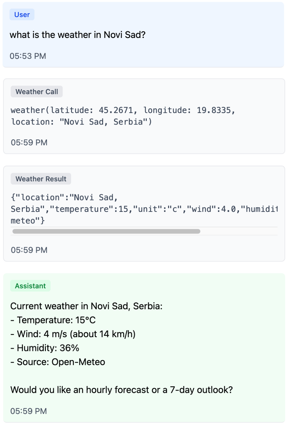
Now the chat can fetch data — and by default it answers with text.
The most direct way to make that answer more visual is to render the tool result nicely. That’s how many chat-based agents work: instead of raw JSON the user sees a card with the result of the tool the model called.
<%# app/views/messages/tool_results/_weather.html.erb %>
<% weather = JSON.parse(tool.content).symbolize_keys %>
<%= render "components/weather", **weather %>
Tool-result UI answers the question “what did the agent just do?”. Generative UI answers “what form of response is most useful to the user right now?”
Showing tool results is useful: the user sees which tools the model called and what data it worked with. But the more internal steps an agent takes, the more a detailed log of its work starts to crowd the main interface. Generative UI solves a different problem: instead of painting in the whole execution trail, it lets the model choose the form of the final answer.
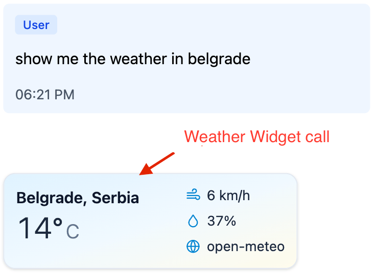
What if, instead of visualizing the result of WeatherTool, we wanted the model itself to ask for a weather card to be shown?
Generative UI with Per-Component Tools
For the view layer to render a component, it needs two things: a component name and attributes (often called props). A tool call already has both: the tool name and its arguments. That’s the first important shift — the data for the UI lives not in the tool’s result, but in the arguments of the call itself. Which means we can introduce a dedicated tool for this component: one that computes nothing, and just serves as a render signal.
class WeatherWidgetTool < RubyLLM::Tool
  description "Render a weather widget inline in the chat."

  params do
    string :location
    number :temperature
    string :unit, required: false
    number :wind, required: false
    number :humidity, required: false
  end

  def execute(location:, temperature:, unit: "c", wind: nil, humidity: nil)
    errors = []
    # validate attributes...

    errors.any? ? { status: "invalid", errors: }.to_json : { status: "ok" }.to_json
  end
end
The tool result here is deliberately short. Its job isn’t to carry UI — only to tell the model whether the arguments were accepted. If you put HTML or the full component data into the tool result, the model will see it on the next step and is very likely to start paraphrasing what’s already on screen. halt looks tempting, but it pulls the conversation into a different problem: the history ends up with an “assistant message” that the assistant never actually wrote.
The view’s only job left is to read the arguments of the parent tool call and render an allow-listed component:
<%# app/views/messages/tool_results/_weather_widget.html.erb %>
<% result = JSON.parse(tool.content.to_s) rescue {} %>
<% args = tool.parent_tool_call.arguments.to_h.symbolize_keys %>

<% if result["status"] == "ok" %>
  <%= render "components/weather",
        **args.slice(:location, :temperature, :unit, :wind, :humidity) %>
<% end %>
One small catch: even with a minimal tool result, the model still tends to add a prose reply under the rendered widget. The cleanest fix is to tell it in system instructions that the widget tool call is the answer — we’ll come back to the same trick with generate_ui below.
For a single component this already works well: the UI component lives outside the model, and the model just picks it and fills in the attributes. But the approach hits a ceiling fast.
The Limits of Per-Component Tools
The weather card is useful on its own, but the next step is more interesting: the model can pick on the fly between cards, containers, buttons, forms, and confirmations — and assemble a response shaped to the task. The same primitives can combine into useful scenarios the developer never planned for. For that you need a shared UI vocabulary, not a separate tool for every new scenario.
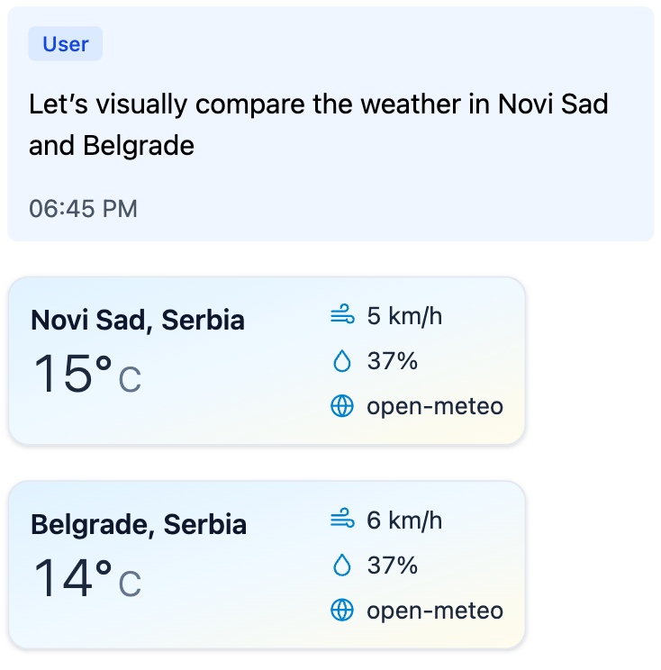
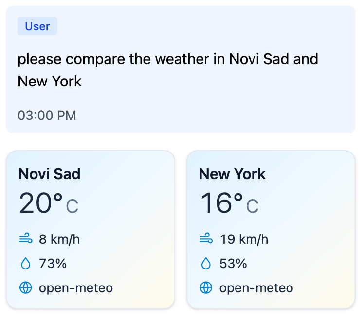
Ask the model to compare the weather in two cities, and it calls WeatherWidgetTool twice and shows two cards. But comparison as a structure never appears: the cards just stack on top of each other.
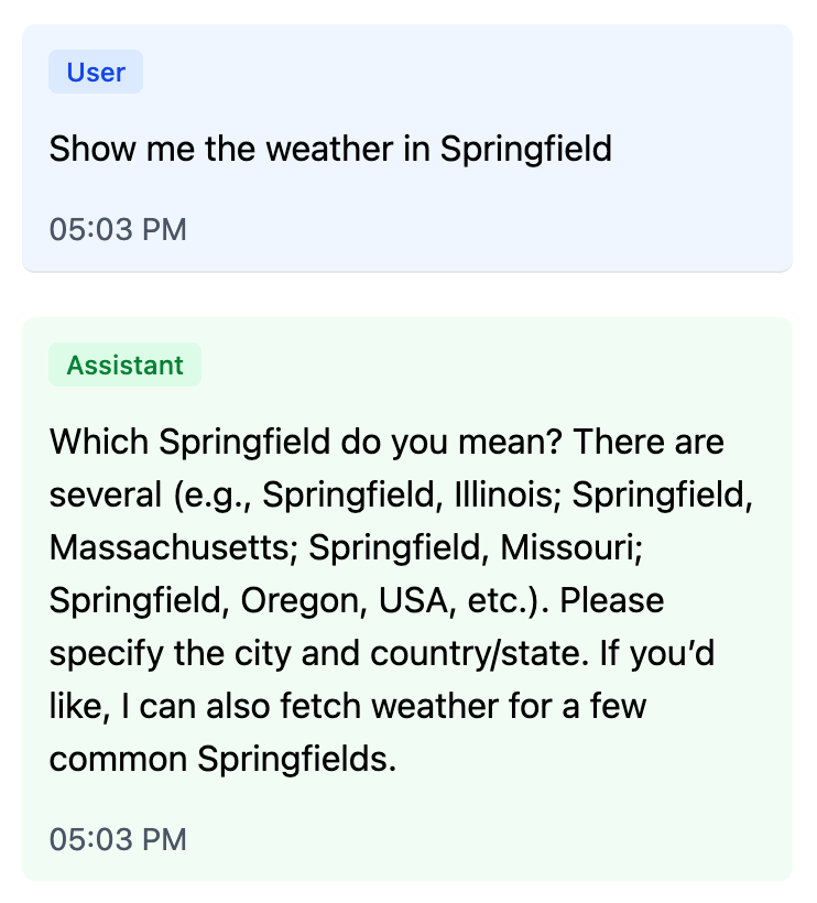
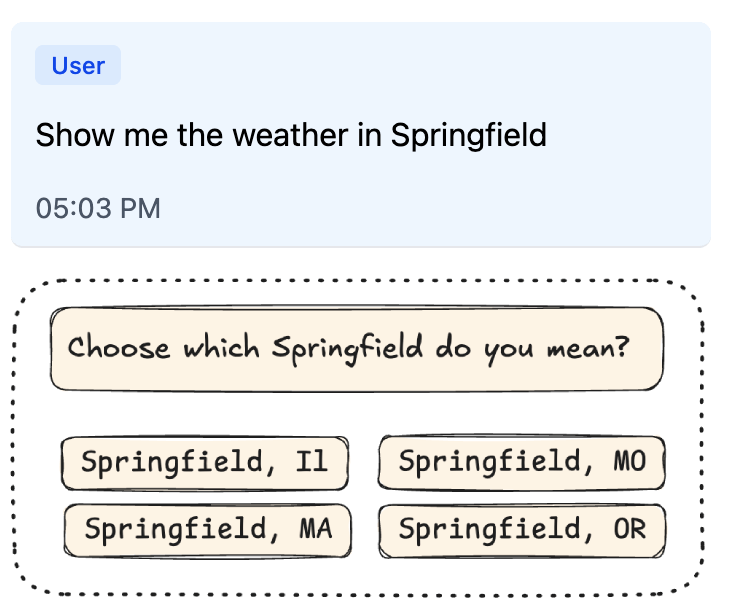
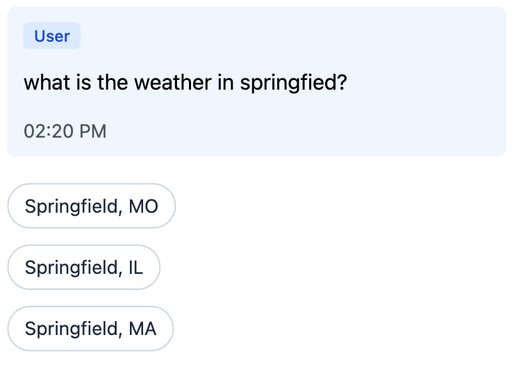
Another familiar case is clarification. A user asks the assistant: “What is the weather in Springfield?” The assistant thinks, calls some tools, and then instead of answering writes: “Which Springfield did you mean?” — forcing the user to type the city or state all over again. Springfield is ambiguous, so the clarification has to happen. The real question is how the user answers it — typing the city or state again, or picking from options with a single click. The interface can do better here: show a picker right away, where the user’s next turn is one tap. The renderer just shows the buttons; turning a click into a new message is the application’s job.
Both cases can be solved with dedicated tools: WeatherComparisonTool for comparison, CityPickerTool for clarification, then ConfirmationTool for confirmations. For a simple product this is a perfectly fine path. The limit shows up later: the catalog starts to grow not by the number of reusable primitives, but by the number of scenarios. Every new UX gesture demands a new top-level tool.
One Tool to Compose Them All
This points to a different move: keep one general-purpose tool for generative UI, and pass the entire response structure as its argument instead of a single component. Let’s call it generate_ui. Same idea — tool call as UI payload — only now the arguments hold not one card, but the whole component tree.
The structure is easiest to pass flat: a single components array, one component with id: "root", and connections between components as plain id references. The component catalog shows up directly in the payload: each node names its own component and carries the attributes declared for it.
{
  "components": [
    {
      "id": "root",
      "component": "Comparison",
      "items": ["novi-sad", "belgrade"]
    },
    {
      "id": "novi-sad",
      "component": "WeatherCard",
      "location": "Novi Sad",
      "temperature": 22,
      "unit": "c"
    },
    {
      "id": "belgrade",
      "component": "WeatherCard",
      "location": "Belgrade",
      "temperature": 24,
      "unit": "c"
    }
  ]
}
This is still a tree in normalized form: one root, references only by id, no cycles, no orphans, no child reused in two places. But now the link between the wire format and the catalog is direct. If a node says component: "WeatherCard", it carries that component’s attribute schema. If Comparison.items is declared as a list of component references, the application can check not just the array type but that the items inside really are weather cards.
With this shape, both earlier cases become compositions rather than new top-level tools: Comparison wraps two WeatherCards, and Picker wraps several QuickReplys.
The simplest hand-rolled version looks like a single presentation tool. It fetches nothing and has no side effects. It accepts a UI tree, validates it, and returns a short status.
In the example below, params describes the shape of individual components, and UiTree.validate would be the application’s validator for whole-tree invariants: exactly one root, all references resolve, no cycles, no orphans, no child reused in two places. COMPONENT_CATALOG here is the same kind of hand-rolled Ruby structure that lists the available components and their relationships. The code of the validator and that structure isn’t what matters here; what matters is the boundary itself — the schema helps the model hit the expected shape, but the application still treats the result as an external payload before rendering.
class GenerateUiTool < RubyLLM::Tool
  description <<~TEXT
    Render inline UI from the available component catalog.

    Arguments:
    - components is a flat array of component instances.
    - One component must have id="root".
    - Component reference fields point to other component ids.
    - The accepted payload must form one rooted tree.

    Available components:
    - WeatherCard: show current weather for one location.
    - Comparison: compare several weather cards side by side.
    - Picker: ask the user to choose between ambiguous options.
    - QuickReply: clickable option that sends a short reply back into the chat.
  TEXT

  params do
    array :components do
      any_of do
        object do
          string :id
          string :component, enum: ["WeatherCard"]
          string :location
          number :temperature
          string :unit, enum: %w[c f]
        end

        object do
          string :id
          string :component, enum: ["Comparison"]
          array :items, of: :string, min_items: 2
        end

        # ...and the same kind of schema for Picker and QuickReply.
      end
    end
  end

  def execute(**args)
    errors = UiTree.validate(
      args.fetch(:components),
      catalog: COMPONENT_CATALOG # same catalog, now used by the server validator
    )

    errors.any? ? { status: "invalid", errors: }.to_json : { status: "ok" }.to_json
  end
end
If the tree is invalid, the model gets a short list of errors and can correct itself on the next step. If the tree is valid, the application can take the arguments of that call and render them as the response to the user.
This sketch shows the mechanics — and at the same time exposes what’s missing: a single place where the catalog is assembled. The catalog is needed by several parts of the system at once:
- the LLM — so it knows from system instructions which components are available and when to use them;
- the provider — to derive the JSON Schema for the
generate_uiarguments; - the server — to validate the tree, component references, and attributes before rendering;
- the view layer — to know how each component should be rendered.
If these four views live separately, the UI tool quickly turns into a set of conventions you have to keep in sync by hand. So we need a single Ruby catalog from which instructions, schema, validation, and render targets are all derived.
Same UX trick as with the widget tool earlier: the system instructions should tell the model that calling generate_ui is the answer — no final text needed. The wiring is shown in the system prompt below.
The GenerativeUI gem
GenerativeUI starts from a single idea: describe UI components once in a catalog, and derive everything else from it. In the current Rails/RubyLLM integration this catalog is wired up through the generate_ui tool, but the heart of the library isn’t the transport — it’s the catalog DSL. The demo app shows everything wired together end-to-end.
class ApplicationGenerativeCatalog < GenerativeUI::Catalog
  component "WeatherCard" do
    desc "Show current weather for one location."

    attributes do
      string :location
      number :temperature
      string :unit, enum: %w[c f]
      string :condition, required: false
      number :wind, required: false
      number :humidity, required: false
    end

    present_with :partial, "generative_ui/weather_card"
  end

  component "Comparison" do
    desc "Compare several weather cards side by side."

    attributes do
      many_components :items, only: "WeatherCard", min_items: 2
    end

    present_with :partial, "generative_ui/comparison"
  end

  component "QuickReply" do
    desc "Clickable option that sends a short reply back into the chat."

    attributes do
      string :label
      string :value
    end

    present_with :partial, "generative_ui/quick_reply"
  end

  component "Picker" do
    desc "Ask the user to choose between ambiguous options."

    attributes do
      string :prompt
      many_components :options, only: "QuickReply"
    end

    present_with :partial, "generative_ui/picker"
  end
end
This single declaration captures everything we used to keep in sync by hand:
- the component name in the payload (
WeatherCard,Comparison,Picker); - the description for the LLM (
desc); - the attribute schema (
attributes); - the structural relationships between components (
one_component,many_components); - the render target for the application: convention-over-configuration by default, with
present_withto point at a specific partial or component.
From this catalog the gem derives component descriptions for the LLM, the schema for generate_ui arguments, tree validation, and render targets.
The catalog can be registered as the default so you don’t have to pass it explicitly to every tool and render call:
# config/initializers/generative_ui.rb
GenerativeUI.configure do |config|
  config.catalog :default, "ApplicationGenerativeCatalog"
end
After that, the chat gets a catalog-bound tool:
tool = GenerativeUI::Tool.new

chat = Chat.create!
chat.with_instructions(<<~PROMPT)
  You are a helpful weather assistant.

  Tool guidance:
  - Use generate_ui when the answer should be shown as UI.
  - IMPORTANT: after calling generate_ui, do not add a final text answer.
    The tool call itself is the user-visible UI response.
PROMPT
chat.with_tool(tool)

chat.ask("Compare the weather in Novi Sad and Belgrade.")
GenerativeUI::Tool takes the selected catalog, merges its description into the tool description, and compiles the provider-facing JSON Schema for the arguments. At call time the tool validates the tree and returns a short result: { "status": "ok" } or { "status": "invalid", "errors": ... }.
In Rails views, the user-facing UI is rendered from the tool call’s arguments:
<%# app/views/messages/tool_calls/_generate_ui.html.erb %>
<% begin %>
  <%= render_generative_ui tool_call.arguments %>
<% rescue GenerativeUI::InvalidComponentTreeError => e %>
  <% ActiveSupport::Notifications.instrument(
       "invalid_tree.generative_ui",
       error: e,
       tool_call: tool_call
     ) %>
<% end %>
The tool’s status result is best hidden from the user:
<%# app/views/messages/tool_results/_generate_ui.html.erb %>
<%# intentionally empty: { "status": "ok" } is control data, not UI %>
By this point the tree has already passed the catalog + validator check. The partial doesn’t decide whether the component can be trusted; it just receives the validated attributes and turns them into HTML.
A leaf component gets plain locals:
<%# app/views/generative_ui/_weather_card.html.erb %>
<article class="rounded-2xl border p-4">
  <h3><%= location %></h3>
  <div class="text-3xl font-semibold"><%= temperature %>°<%= unit.upcase %></div>

  <% if condition.present? %>
    <p><%= condition %></p>
  <% end %>
</article>
A container component receives children that are already rendered:
<%# app/views/generative_ui/_comparison.html.erb %>
<div class="grid gap-4 md:grid-cols-2">
  <% items.each do |item| %>
    <%= item %>
  <% end %>
</div>
The partial is just one of several render paths. The gem can also render through ViewComponent or return a JSON representation of the tree; if you need something else, the application can register its own renderer.
One caveat worth naming: even with explicit system instructions, models sometimes still add a short prose answer to a turn that already produced a generate_ui or widget tool call. The behavior varies between providers, models, and even individual requests. If the duplication matters for your product, the application can handle it on the view side — for example, by suppressing trailing assistant text on turns that already rendered UI. It’s a small ergonomics layer, not a structural problem with the approach.
Where this leaves us
Generative UI today means very different things to different people: from polished rendering of tool results to an interface that rebuilds itself in real time around the user’s intent.
I tried to focus on something more down-to-earth: what you can do right now in an ordinary chat-based application — without a custom runtime, without HTML generated by the model, and without rebuilding the product from scratch. All it takes is to give the LLM not the whole screen, but a strictly described yet composable catalog of components.
In this approach the model doesn’t draw the interface directly. It picks from allowed primitives and assembles a response tree out of them. The application validates that tree and renders it with its own renderers. Because of that, the final UI isn’t tied to one platform: the same generative payload can be shown on the web through Rails partials, in a mobile app through native components, and in Telegram or WhatsApp — through their buttons, lists, and messages.
Generative UI is no longer just “a chat with widgets,” but it hasn’t settled into one canonical pattern yet either. A good way to find out where its real shape lies is to assemble a small catalog of components and try it out in a live conversation.